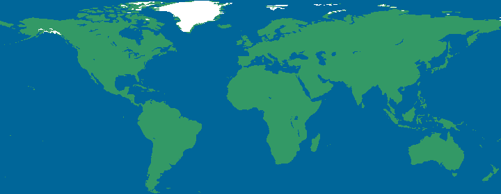
This map is one of the most interesting maps that I've been able to find because it takes the idea of a basic map and changes the idea a little bit, uses the technology of today, and makes something that is extremely useful and easy to understand. This map is known as a cartographic animation map and is basically a map that is able to display data that has been gathered over periods of time, however, instead of showing the average of range or even data from just specific point in time, these maps are able to show the continuous data over the entire interval. The above map was used in a study of plant production and biomass in different parts of the world and how that relates to different levels of chemicals and elements near these places. Due to the fact that all of the images are put together in an animation form, it helps to better display the trends across the globe and give more of a bigger perspective on things.
No comments:
Post a Comment